While at Disney, I was able to design the graphics for the runDisney Marathon Expos. I was able to design for many of the races including the Princess Half Marathon, the Wine and Dine Marathon and my favorite, Walt Disney World Marathon. For the Walt Disney World Marathon, each race was named after one of the big 3; Mickey, Goofy and Donald. Below you can see just a sample of the banners I did for the Walt Disney World Marathon.


Finding your Fun
While at Thinkwell Group. I worked with Nickelodeon to create a way finding signage system for a family entertainment center that they were developing. The signage system needed to feel modern with a touch of Nickelodeon fun. I came up with a style that uses a layered translucent material with a slime looking texture on top of an aluminum backing panel. This created a layered look and with the drip shapes at the bottom, the signage feels as it is dripping with slime. For the family entertainment center, Nickelodeon wanted a large map sign of the center as well as different directional signage that can be placed throughout. Here you will see concepts drawings, color studies and Sketchup models of this way finding system.


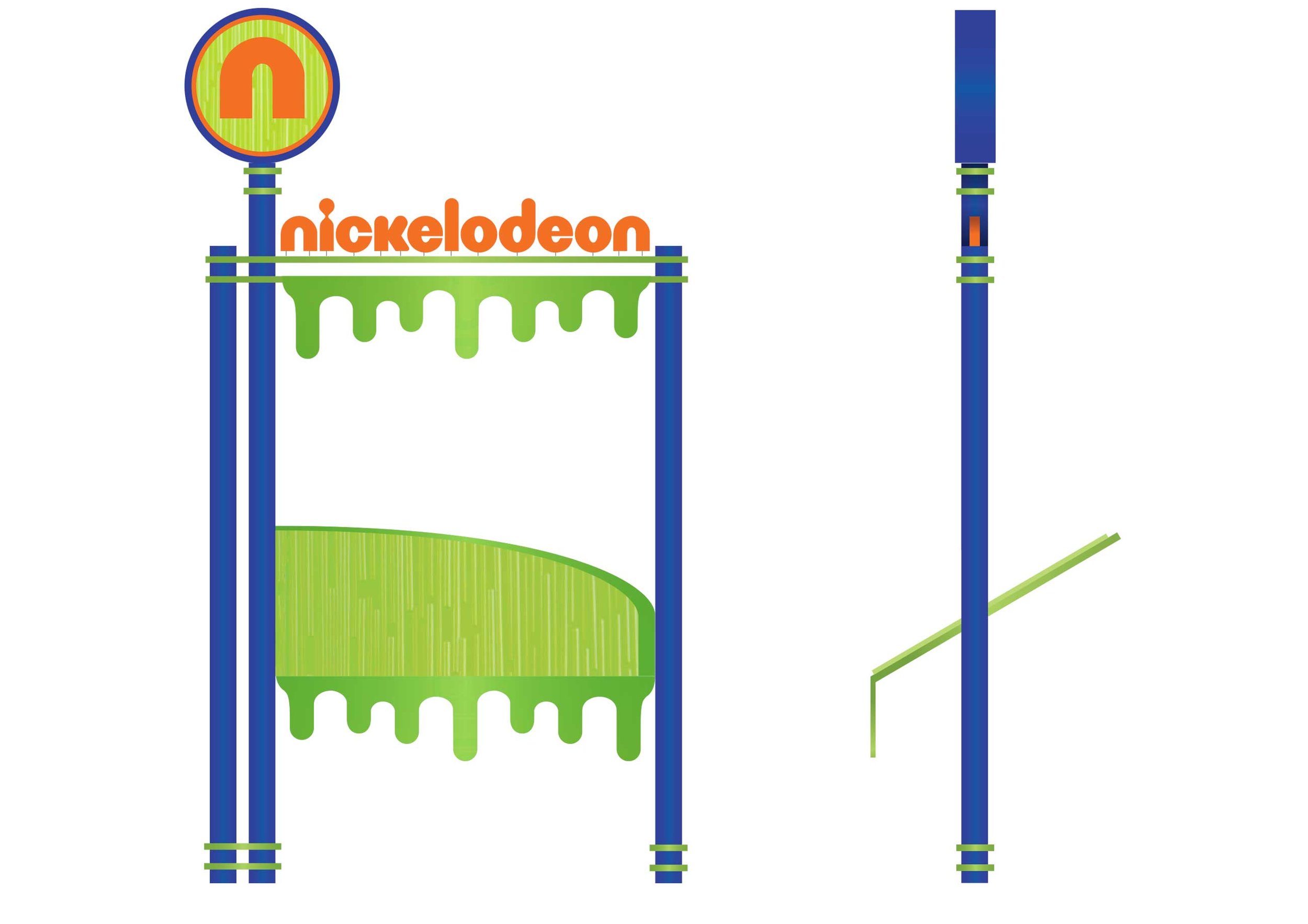


© Nickelodeon
The Story Teller's Trailer
Sometimes the best ideas never see the light of day. While working at Thinkwell, I was part of the design team working on a theme park in China called the Monkey King. The park was themed on the classic stories of the Monkey King fables. In the “Main Street” area of the park, there was going to be an old trailer with a story teller that was going to tell the tale of the Monkey King using elaborate puppets. This trailer was going to be the stage for his puppets to tell these stories. Here you will see sketches, artwork and a 3D model of what the puppet trailer was going to be.


100 Years of Red Cross Greatness
The American Red Cross is celebrating 100 years in Los Angeles. For this centennial celebration, I was asked to design a “100 years” logo and marketing campaign. They wanted the look to be modern and trendy, in other words, they wanted the design to be very “LA”. My concept for the logo was to keep it very clean an simple, but making the "LA" very trendy and iconic. For the marketing, I used a geometric pattern that was developed from the letter “A” and incorporated pictures of the city into the tonal background.


Nick Nacks
Subscription gift box that give fans one of kind merchandise have become very popular over the last 3 years. Companies like Loot Crate, Kawaii Box and My Geek Box have become very popular with subscription gift boxes. Larger companies have now started to play with this idea. Marvel has launched“Marvel Collector Corp” and Warner Bros have launched the “The Wizarding World Crate”. Nickelodeon also wants to join in with the subscription box service and I worked on a concept with their brand called “Nick Nacks”. This box plays with there brand and famous characters. I used their main green color that Nickelodeon has made famous from their slime and did a tonal green version of all the cartoon characters. For the edges and for the main logo, I used the official orange color and the “splat” icon that they made famous with their brand since the early 90’s. With all these different elements and styles, it all came together very nicely. And who doesn’t like to have “Nick Nacks”.


© Nickelodeon

© Nickelodeon
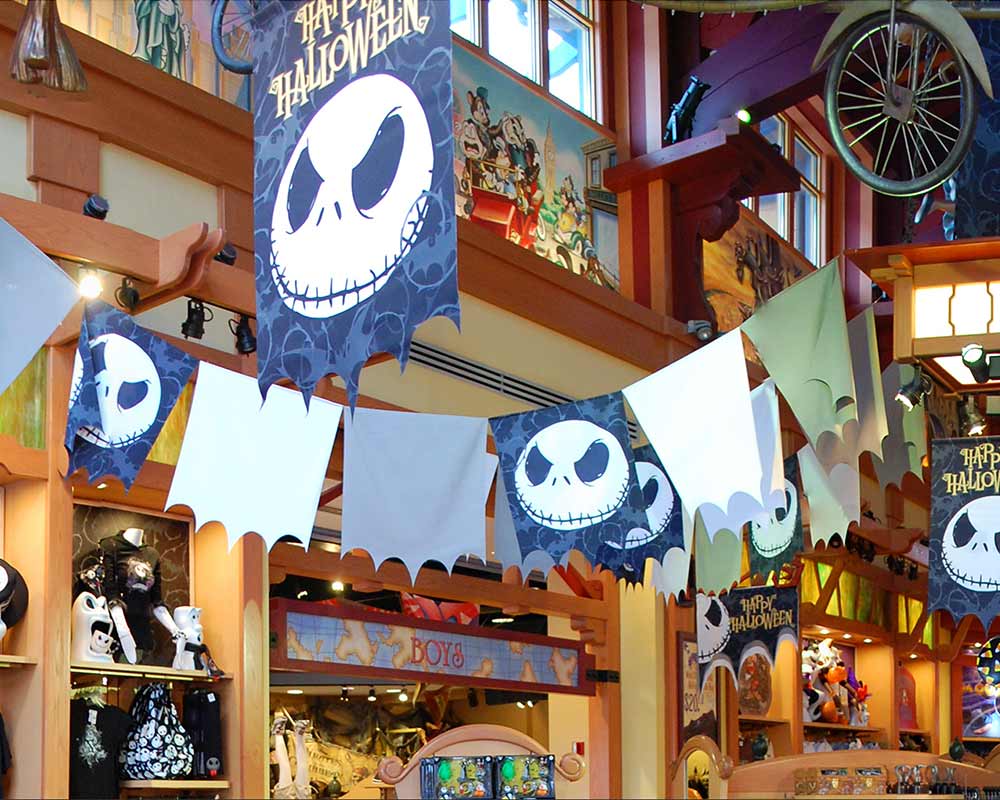
Come with us and you will see, this, our town of Halloween
While working at Disney Theme Park Merchandise, I was able to design the Halloween graphics that were used at Walt Disney World and Disneyland Resort. The graphics were themed around pumpkin Mickey and Jack Skellington from Nightmare Before Christmas. These graphics were used at all the major stores, from the Emporium on Main Street to World of Disney.


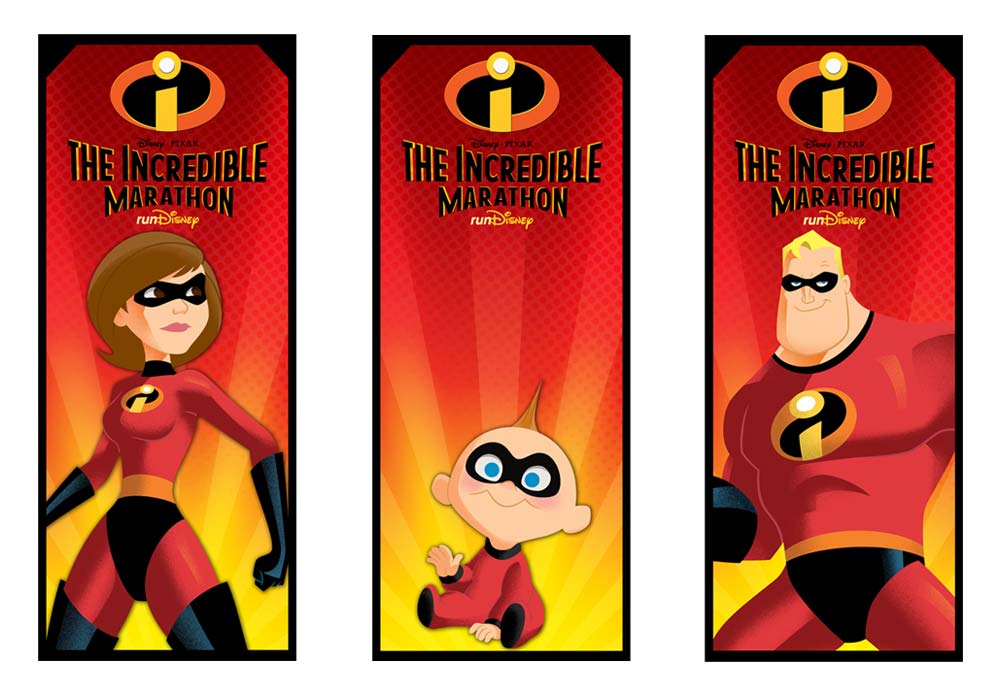
An incredible Marathon
Run Disney has grown in popularity in the past 10 years. They have added races such as the Super Heroes Half Marathon that is based around Marvel’s Avengers and the Star Wars Half Marathon (they have a light side marathon and a dark side marathon) to go with their already popular marathons such as the Disneyland Half Marathon and the Walt Disney World Marathon. All the major franchise are represented from Lucas to Marvel to Disney…except one. And that is Pixar. So I designed a marathon based around the Incredibles. The reason I chose the incredibles over other themes like, Toy Story or Monsters Inc. was that the Run Disney Marathons are about families and they have races for all ages, from a baby crawl to a race for kids to the full marathon for adults. I thought what better theme then a family of super hero’s to have a marathon for a family of runners. You will see my concept design for this idea, that I call the Incredible Marathon.


Running with the runDisney app
Run Disney has grown in popularity over the past 10 years. With the massive growth of the events, both at Disneyland and Walt Disney World, more and more people are signing up for the different marathon events. I felt that run Disney and the participates could benefit from a running app. I designed a run Disney app that helps runners train for the marathons that they are running by keeping progress of there running workout. This app would allow people to register for the marathons through the app with a “one touch” register. It would allow you access to coaching help, nutrition advice and even allow you to buy the newest run Disney apparel and much more. I am hoping, one day, that this app will be part of the run Disney experience.


Year of the Rabbit
What better to celebrate 2016, then New Years at Disney's Pleasure Island. Every night at midnight, "New Year's Eve" was celebrated with a fireworks show. This tradition lasted from 1990 through New Year's Eve 2005. I designed a couple shirts featuring Jessica Rabbit that was inspired by the large sign of her welcoming you to Pleasure Island. The shirt colors and type were inspired by Pleasure Island logo with a vintage touch.


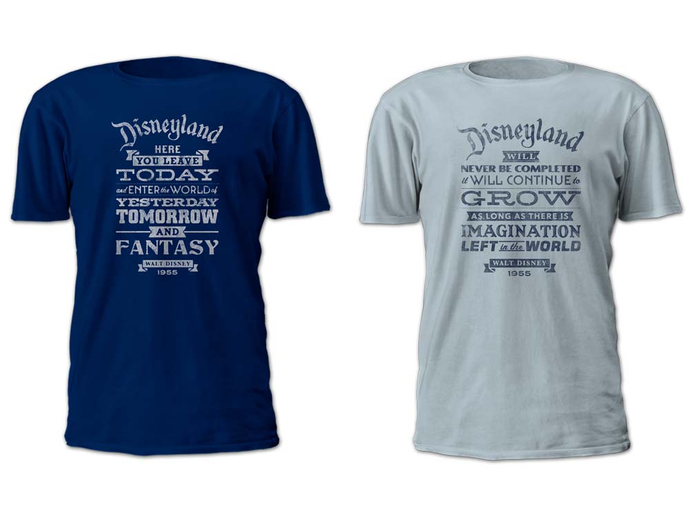
What Walt Said...
I was able to work merchandise based around famous quotes from Walt Disney. These are probably two of the most famous quotes Disney said and are quotes that can be found in Disneyland. I didn't want to have any images that would take away from the quotes, but by using different fonts, make the quotes a graphic in itself.


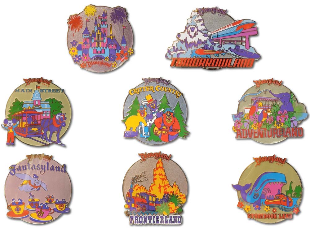
2015 D23 Expo
I worked with Mickey’s of Glendale to create merchandise for the D23 Expo. I was inspired by art that was on an old Disneyland bag from the 1980’s. I recreated the art and gave it a fresh update. The new Disneyland icon art was used on many products from T-shirts to pins and much more.


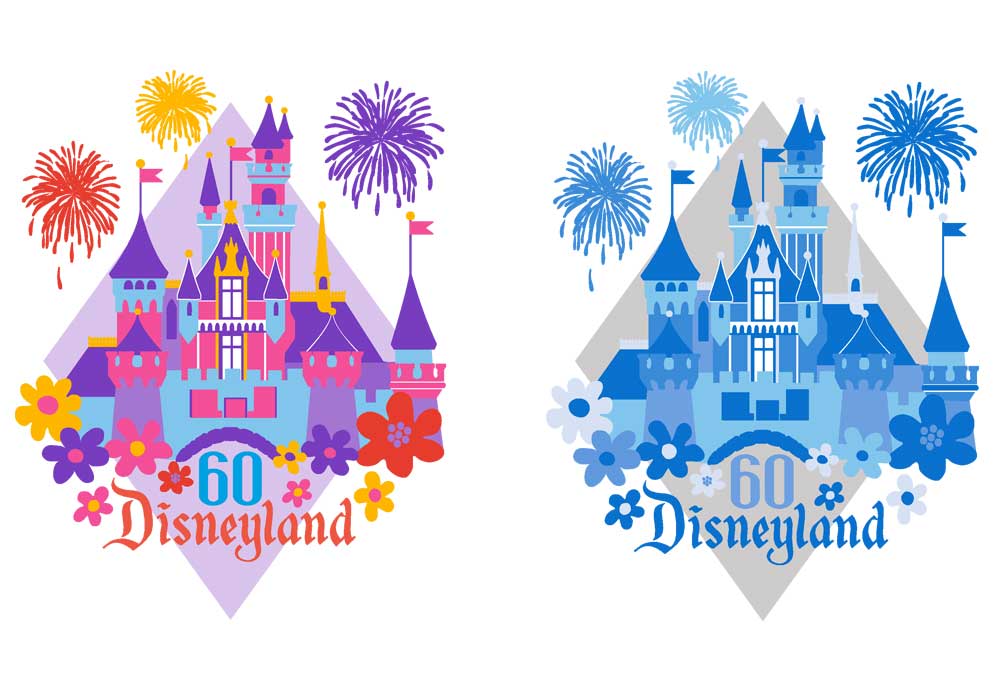
Happy 60th Birthday to Disneyland
On this day 60 years ago, Disneyland opened. Throughout Disneyland 60 years, old rides have closed to make room for new thrill rides, but even with all these modern updates, you can still image Walt walking down Main Street, looking at the details of his park. There is something special when you walk into Disneyland. Many parks (including other Disney parks) have tried to capture this special feeling, but have been unsuccessful. Disneyland is truly a special place. To commemorate the 60th anniversary, I designed a logo based on a Disneyland graphic from the early 80’s. I did one logo in vintage colors and one in the blue colors that is part of the “Diamond Celebration”.


Happy Birthday America
I wanted to do a Disney design to celebrate the 4th of July… and of course make it feel vintage. I didn’t have to look to long to find some great art that was created for America’s Bicentennial celebration in 1976. Disney created the “America on Parade” that ran from summer of 1975 and to run through 1977, to commemorate the United States Bicentennial. Disney created a character logo to along with the parade that features Mickey, Donald and Goofy dressed in revolutionary costumes. This art is so well done that I wanted to bring it back to celebrate the 4th of July, but keep it as untouched as possible. I digitally traced the original and cleaned it up, before making it look like a screen printed vintage graphic.


Friendlyable and Funable; Vintage Disney Ads
I love designs from the 1950’s and 60’s with the great type and fun stylized characters. A great example of this are the Disneyland ads “Funable”, Friendlyable” and “Date Night”. These ads were to promote Disneyland and the design of the ads shows off that stylized feel. These ads fit in with vintage Disney look that everyone enjoys. I traced these ads and cleaned them to only make them look vintage again. And what better way to show these vintage designs off then on a vintage looking T-shirt.


Fun with the Funmeister
The Funmeister was a character developed specifically for Pleasure Island. Even though there isn't much known about him, he become the icon of the Pleasure Island and is found on the original logo. I thought it would be fun to develop merchandise based on him and how that may look. With the help of Mickey's of Glendale, I was able to bring some of these design to life.


Port of....Design
Port of Entry at Universal's Islands of Adventure is one of my favorite places just to walk through and look around. The details and theming of this area is so good. But what makes it feel authentic is the use of hand painted graphics onto the buildings. Here are a few examples of the graphics and signage you can find there.


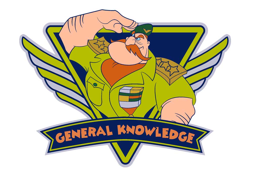
Knowledge...General Knowledge
Cranium Command was one of my favorite attractions at Epcot. When the Wonders of Life pavilion closed in 2007, so did Cranium Command. This ride had a unique look inside of human head and how it is controlled by Buzzy, an Audio-Animatronic, with help of some other friends. But one of the best characters was General Knowledge. I come up with a shirt design based on General Knowledge.